In what ways does your media product use, develop or challenge forms and conventions of real media products?
My main product and ancillary texts use and develop forms and conventions of real media products, they do this in various ways.
Firstly I shall speak about how my main product used and developed forms conventions of real media products. My main product was the film trailer/teaser trailer, there were various things that I would have to think about when filming for the production process and editing process.
Some of the main elements that film teaser trailer may include are a voice-overs, sub-titlings (reviews, interviews and quaotes about the film),opening titles showing main company name and maybe the film company name, ending title saying the title for the film and a title saying the date of release (quite alot of the time these titles can be done together).
To use the forms and conventions of a real media product I had to include these elements within my trailer. I used a voice-over saying about a tape being sent to you, this also uses direct audience address, with the voice-over I added an effect to the recording of the voice to make it have a slight echo and for it to be a deeper pictched voice, this made it sound more unique and made it seem slightly more disturbing for the audience.
I used sub-titlings saying things that could have been quoated about the film, this draws the audience in to reading what has been said about the film, to see if it would there type of film to go and watch. I used three sub-titlings in my trailer with gaps of footage/video in beetween to keep the audiences attention whilsit still giving them information.
I also used both an opening company title and an opening filming company title, the opening company title was for 'Universal Studios' and the filming company title I made using adobe after effects myself 'MJM productions'. This gave the audinece a know of companies that could have been used for the film and it uses more of the forms and conventions that would be used in a real media product. This was the same with the ending titles, I used the idea of putting the film date realease with the film title name on one title clip, I made the title using adobe after effects.
It also sticks to the forms and conventions with using a plot for the trailer, it shows a small bit of act one and gives the impression to the audience that the characters have just arrived back from a holiday or some where off island as the opening shot is a shot that I filmed out of a window of a plane and the next shot is both of them walking through a door with suitcases.
The film trailer shows parts of the middle of the film and then leaves it on a bit of a cliff hanger, making the audience wonder what has just happened etc and making them want to see the film when it comes out. It also uses forms and conventions of a teaser trailer using a soundtrack in the film, the sound track was made by me using the program Garageband. Using a soundtrack brings together all the clips and gives it a better background noise, if there is any silence etc. It also makes it more interesting to watch.
The ancillary texts are both in a print type format of media, one being a poster and the other being a film magazine front cover both advertising the film from in the teaser trailer. The they both use the forms and conventions of a real media product.
With a poster you usually have, one main image, the main film title, a date release line and the actors names section and extra information section at the bottom of the page. In my poster to stick to the forms and conventions I used each of these things. The main image- one of the film character cover in blood, the main film title- 'Bloodshed', the date release line-In Theatres May 26, Actors names-Carl jenkins, William Robinson, Dom Norman, extra information-directors names, company names etc.The film magazine front cover also sticks to the forms and conventions of a real media product, It uses a main image-the face with the drill, A masterhead (saying the magazines name)-Filmdays, advertisements-free posters etc, date line-june 2009, a barcode, coverlines-things that are covered in the magazine etc.
I feel as If my products used and developed forms and conventions for real media products very well and that from the feedback that I recieved the final products most have done it well as they were all liked.
How effective is the combination of your main product and ancillary texts?
The combination of my main product and ancillary texts work effectivally as they link with pictures, ideas and genre. The poster uses an image of one of the films characters covered in blood, this links back to the film and reminds the audience about the film, making them want to go and see it.
It shows genre with a graphic picture, the blood links in with the film genre being a horror/thriller film as within that genre there tends to be violence, action, blood etc.
I used a photo of the drill from in the film to use on my magazine front cover. The drill shows a link to the film with mise-en-scene as it was a prop used in the film.
Each of my products link to each other with mise-en-scene, genre, overall feel to the product and characters used within the product as footage or an image.
I feel as if the combination of the main products with the ancillary texts work really well. I also was told by a few people when getting feedback that they could really see the link and all the products worked really well together.
I can tell that the products work well together and show good links as the audience can tell that they are all for the same film. This would be so that the poster would show people to look forward to the film and they would then want to see the trailer, they'd be able to find and see the trailer as they'd be able to look for charcter links or title links etc. Also after that or before they may see it on the magazine and want to read about it.
What have you learned from your audience feedback?
To get feedback I did anything I could, I tried sending my trailer to a few proper film companies like Touchstone and Universal Studios Pictures and other well known film companies but I didn't receive any replies in time.
I then showed all three products to various teachers around my college to see what they thought about each of them. One teacher said they liked the camera shots as it gave them a different view to see it from, they also said that the transitions were not noticeably and it was a good use of continuity editing at the start of the trailer. Another teacher said it looked really well done and some what professional.
The comments I received about the magazine and the poster were amazing, one teacher said that they thought I was just showing them a random magazine front cover, they didn't believe I made it, they said it look to professional. Other comments were similar and mostly all my feedback was positive, except for the odd person saying it was gruesome but it was meant to be so these comments weren't that bad.
My media teacher told me that the voice-over for my film trailer was to quite and that the opening shot wasn't interesting enough. These were both later changed and I added a new shot which I filmed whilst taking a trip out of a plane window. My media teacher also told me that the there was to much black in the background to the poster and that the image needed to be bigger to change this and make it look better, this was later changed in the production process. My media teacher really liked my film magazine front cover and only had positive comments.
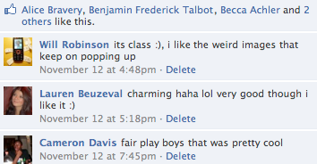
Other feedback I received about my film was recorded on a website called 'facebook' after uploading my work on to the website, I received comments and people saying that they liked it etc. Below Are a few of many comments and also shows that people liked the film.


If I were to do this all again I would make the genre different, something not as dark, I would do a comedy genre as it would be a nice change. I would also use a bigger range of camera shots, and use more exciting locations to film my trailer. From feedback I have learnt a few things that helped and made my work better after changing things after hearing Ideas. Overall from feedback I have learnt that hard work really does pay off.
How did you use media technologies in the construction and research, planning and evaluation stages?
Throughout doing my coursework I have used various forms of media technologies in the construction of research, planning and with the evaluation stages. This ranges from using a voice recorder to using a video camera to using Adobe After effects and much more.
For the research process I had to use the internet to find out about other films, find videos and download images of perfessionally made posters and film magazine front covers. I used various search engines such as 'Google' and 'Dogpile'. This was helpful as I was able to find pretty much anything I wanted and find out anything I needed to.
When constructing during the planning process I used a camera to take photos of my storyboard, I also used a photocopier machine to scan the storyboards into the computer. I then up loaded these on to the blog, also I cropped these images and added them to a video on the program iMovie and made my animatic for the film, this was to show what I wanted my final film to be laid out like. I also used the program Garageband to make some music to add to the background of my animatic to show genre.
Also in the constructing process for planning for my film magazine and for my poster I uploaded images i had drawn using the scanner to show what I'd like my layout and look for my poster and film magazine front cover to look like. When producing the film I used many different forms of media technologies to make my products, I used the program on an Apple Mac called iMovie to edit and make my film, cutting the clips, adding titles and adding transitions etc.
Also I used the program adobe after effects to make my titles for the film. This was interesting as I had never done this before but it turned out to look good and work well within my film.
To make both my poster and film magazine front cover I used the program Adobe Photoshop to edit photos, add texts and to make my final product. It worked well and came together well.
When evaluating my work I used photoshop and Microsoft to make a comparisons sheets for both my magazine front cover and poster. I also used iMovie to make evolution, directors chat and other videos, adding music in the background and recording a voice over.
In the research, planning and evaluation stages I used various forms of media technologies to make a range of things, I enjoyed making my work and would not change anything that I did with using programs to make my products.


 Please click image above to enlarge.
  Please click on the image above to enlarge.